The co-founder said it wasn’t on the roadmap. I built it anyway.

Three months into the company, three product teams were building the same UI patterns independently, nobody had a single source of truth, and accessibility had no defined standards.
This is how I convinced a skeptical co-founder, got through a team that refused to adopt the system, and fixed my own broken foundations along the way.
Three months in. The cracks were everywhere.
I joined the company three months before this project started. I hadn’t been around long enough to stop noticing the rough edges. When you’re new, you catch things that people who’ve been inside the product for years just don’t see anymore.
There were three product teams shipping independently. On paper, that looked healthy. In practice, each team had quietly built their own version of the product’s visual language. Same company. Same users. Three different ideas about what a button hover state should look like.
The things I kept running into: one surface confirmed a destructive action with a single click. Another made you confirm twice. Tables had different spacing depending on who built them. Error states looked different in every part of the product.
Nobody did this on purpose. It’s just what happens when teams move fast with no shared reference.
“Around 37% of design time was going into recreating patterns that already existed somewhere else in the product. Not improving them. Just recreating them.”
Inconsistency audit — same pattern, three implementations ( Screenshots from live product )


And then there was accessibility. No defined contrast standards, no shared focus states, no agreed rules for interaction. Nobody had made it a system-level responsibility, so nobody owned it.


The co-founder said no.
When I brought this up, the co-founder was direct: “A design system isn’t on the roadmap. I need you working on the product.”
He wasn’t wrong. We were a growing company with real features to ship and real users waiting on them. A design system is invisible to users. It doesn’t show up in a release note. Nobody tracks it on a dashboard.
So I came back with data instead of a design argument. I pulled two months of tickets and showed him how much time had gone into rebuilding components that already existed somewhere else in the product. I drew out what the product would look like at twice the current scale. How many inconsistencies. How many accessibility complaints. How much engineer time wasted rebuilding the same front-end components from scratch.
It wasn’t a design argument. It was a resourcing argument. That’s what landed.
He gave me six weeks and one condition: the product work doesn’t stop. I said fine. I’d do both.

That condition mattered more than it seemed. It meant I couldn’t disappear into system work and ignore the product. The system had to prove its value quickly, while real shipping was still happening. Which is probably the only honest test of whether a design system actually works.
Foundations before components. Always
The temptation with design systems is to start with components. They’re visible. You can show a button library in a review. People get it immediately.
But a component built on a bad foundation is just a prettier version of the same problem. If spacing isn’t systematised, your button looks right but sits wrong relative to everything around it. If colour tokens aren’t defined, your component library is just a collection of hex codes with no logic behind them.
So I started with tokens.
Tokens: naming the decisions
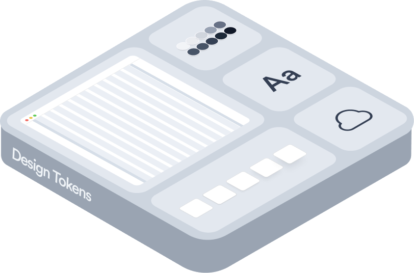
Every colour, spacing value, and border radius became a named decision. Not #2C5BFF. color.primary.default. Not 8px. space.2. The name carries the intent. The hex code is just the current value of that intent, and it can change without the name changing.
Spacing locked to a 4px base. Typography set to a clear scale with named roles: heading, body, label, helper. Accessibility standards defined once at the token level so components couldn’t accidentally break them.


Components are just tokens with behaviour.
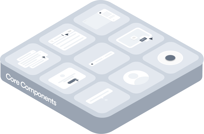
Once the foundations were in place, components were mostly assembly. Taking decisions that already existed in the token layer and giving them interactive form. The actual design work at the component level was about variants, states, and edge cases.
Buttons, for example. There are only four decisions a designer actually needs to make: which hierarchy level, which size, whether it has an icon, and whether the action is destructive. Everything else — colour, spacing, radius, focus ring — comes from tokens. Lock those four decisions as props and you’ve made it structurally impossible to create a fifth off-brand button style.


I shipped a broken system. Here’s what I got wrong.
The first version had inconsistent variables and broken auto-layout across a lot of components. Something that looked fine at a fixed size would break the moment an engineer stretched it or dropped it into a different context. Text overflowed. Padding collapsed. Auto-layout was either missing or set wrong on nested frames.
It was embarrassing. I’d built something to enforce consistency and shipped something inconsistent. Engineers started flagging mismatches between Figma and what the components were supposed to do. Some started building around them instead of from them, which defeated the whole point.
The fix wasn’t just cleaning up auto-layout component by component. It was slowing down. I’d been too focused on covering surface area quickly, shipping as many components as possible to show visible progress. Not focused enough on making each one structurally sound. The rebuild took longer but produced components that actually held up.
If I were starting over, I’d talk to senior designers who’d built systems before, collect references properly, and name everything from the start with a real convention. A lot of the auto-layout mess came directly from inconsistent naming, which made it hard to track what was intentional and what was a leftover from an earlier version. Good naming isn’t a nice-to-have. It’s structure.


One team was on a deadline. They didn’t wait.
The reporting team was under pressure. They had a feature to ship, the deadline wasn’t moving, and the design system didn’t have what they needed yet. So they did what any team does under pressure: they built their own components.
Custom table variants. Custom filter patterns. Spacing that didn’t follow the 4px grid. All of it shipped before I could get to them.
I could have turned this into a process issue. Insisted on a request queue, set up a governance rule. But that would have made the system feel like bureaucracy. Teams don’t use systems they find bureaucratic.
Instead I sat with their engineer and went through every custom component one by one. A few got absorbed into the system with small changes. They’d actually solved a real gap I hadn’t addressed yet. A couple were genuinely one-off and didn’t need to be in the system. One revealed a multi-select pattern that two other teams would eventually need, and it became one of the most-used components in the library.
The best contribution to the system that quarter came from the team that was ignoring it.
After that session, the reporting team’s adoption went from near-zero to 89% of new UI using system components within two months. Not because I mandated it. Because I showed up, listened, and made the system work for them instead of asking them to work around it.

The moment I knew it was working.
There wasn’t one single moment. It was more like a slow build-up of evidence that something had actually shifted.
The first sign was visual. The products started looking like they belonged together. Not identical, but coherent. Same spacing logic, same hierarchy, same rhythm. People moving between product areas stopped hitting those small micro-jolts of inconsistency.
The second sign was behavioural. Task completion times dropped. Not dramatically, we weren’t rebuilding workflows. But the kind of drop you get when cognitive load goes down. When someone already knows how a confirmation dialog works because they’ve seen it twenty times, they don’t think about it. They just do the task.
The third sign came from engineering. One of the engineers who’d been most skeptical early on sent a message saying a feature that would have taken two weeks shipped in four days because everything they needed was already in the system. That one message did more for adoption than anything I’d written in documentation.

This is what the product looked like before.
These aren’t exaggerated for effect. Three teams, three product areas, the same UI patterns. Each slightly different in ways that had no reason to be different.

What actually changed.
4 different button hover states across the product
One button system. Zero ambiguity.
5 custom confirmation dialog implementations
Single modal component, fully configurable
Spacing decided per-screen, per-designer
4px grid enforced at the token level
No defined accessibility standards
WCAG AA enforced at the token level
37% of design time spent recreating existing UI
63% reduction in repeated design work
New designers took weeks to produce consistent UI
New designers productive in their first week
Engineers rebuilt front-end components from scratch
Engineers building from shared components
4 different button hover states across the product
5 custom confirmation dialog implementations
Spacing decided per-screen, per-designer
No defined accessibility standards
37% of design time spent recreating existing UI
New designers took weeks to produce consistent UI
Engineers rebuilt front-end components from scratch
One button system. Zero ambiguity.
Single modal component, fully configurable
4px grid enforced at the token level
WCAG AA enforced at the token level
63% reduction in repeated design work
New designers productive in their first week
Engineers building from shared components

Feature teams shipped UI-heavy work significantly faster once a complete
component library existed to build from.
Feature teams shipped UI-heavy work significantly faster once a complete component library existed to build from.
Recreating existing patterns dropped dramatically across all three product
teams. Designers spent their time on net-new problems.
Recreating existing patterns dropped dramatically across all three product teams. Designers spent their time on net-new problems.
Teams made correct decisions independently. Less escalation, fewer last-mile
fixes, faster shipping.
Teams made correct decisions independently. Less escalation, fewer last-mile fixes, faster shipping.
Contrast, focus states, and tap-target sizes are defined once at the token level.
Components can’t accidentally break them.
Contrast, focus states, and tap-target sizes are defined once at the token level. Components can’t accidentally break them.
New designers shipped production-quality UI in their first week — previously a
multi-week onboarding curve.
New designers shipped production-quality UI in their first week — previously a multi-week onboarding curve.
These numbers are from the first 8 months. But the real proof came later. I’ve now been at this company for four years. The system I built three months in is still the foundation every team builds on. Through product pivots, a growing design team, and dozens of features I never anticipated when I designed the first token. That’s what good foundations do. They outlast the context they were built in.
How the system evolved.
The system didn’t arrive complete. It grew in response to what teams actually needed, and broke in places nobody expected. Here’s what each iteration actually touched.

The fixes in iterations 3 to 5 were uncomfortable to write down. But they’re the most honest part of this case study. The system didn’t come out right the first time. Pretending it did would make this useless to anyone actually trying to build something similar.
What I actually learned.
Talk to the co-founder in numbers, not design principles
The design argument, “inconsistency is bad UX,” didn’t land. The resourcing argument, “here’s how many hours we’re spending rebuilding things that already exist,” did. Senior stakeholders don’t argue with data about their own product. If you want to change something structural, make the cost of not changing it visible.
Ship it broken, then fix it properly
The design argument, “inconsistency is bad UX,” didn’t land. The resourcing argument, “here’s how many hours we’re spending rebuilding things that already exist,” did. Senior stakeholders don’t argue with data about their own product. If you want to change something structural, make the cost of not changing it visible.
The team ignoring you is your most useful collaborator
The reporting team’s custom components were frustrating to see at first. But sitting with their engineer for a few hours produced more improvements than months of solo work. People who aren’t using your system aren’t the problem. They’re a signal. What they built around tells you exactly what the system failed to provide.
Name things like they’ll outlive you
If I started over, I’d spend more time talking to senior designers and collecting references before naming a single token or component. Bad naming is invisible debt. You don’t feel it until six months later when nobody can find anything, nobody knows what’s deprecated, and the system starts fragmenting again for a completely different reason than before.
Reach out and get in touch
Contact me and let’s create magic
with design. amithcmyk@gmail.com
OR find me here

